Friday, May 17, 2013

The Joys of Gardening and Teaching

Lily-blooming tulip, Ballerina
This spring, I am once again enjoying my tiny postage stamp garden. I was especially enthralled with a few tulips I grew, and the way they changed over their bloom time.

The first is a lily-blooming tulip, Ballerina.  When it was new, on cool days, it had gorgeous tones of purple that picked up on the grape hyacinth behind it. As it matured, it mellowed into a pumpkin-y orange, and it's pointed petals looked nice with my lacy japanese maple.

Lily-blooming Ballerina tulips against a dwarf japanese maple.

The second is un-named. I don't remember buying or planting it. However, I was thrilled to watch it change, from a pale lemony yellow in the early days to a stunning sunrise array as it matured.

unnamed tulip with ajuga and euphorbia
the same tulip as it matured


Children's Book Illustration 2 students, 2013- Corey, Jeff, Claire, Sarita, Rebecca, Bob and Chie.

     Watching these flowers grow and change reminded me of teaching. I feel the same thrill when I watch my Children's book Illustration students at RISD-ce. Their hard work is beautiful at every stage, and it's so satisfying to see their art grow and mature.

Sunday, May 5, 2013

Illustration Friday # 27: TRIBUTE

cover to Rochel Coleman's Tuskegee Airmen album, art by Cheryl Kirk Noll

This week, I'm posting an older piece for the Illustration Friday "Tribute" prompt word.

This is a CD cover I did for Rochel Coleman, a professional storyteller who has lived in Providence. His uncle was one of the historic Tuskegee Airmen, black pilots who flew combat missions over Africa and Europe in WWII, and one of the stories that it tells is a tribute to these men, who broke racial barriers.

On a related note, I recently read an interesting YA book by Sherri L. Smith titled "Flygirl." It was about a young black woman who "passed" (as white) in order to serve in the Women's Airforce Service Pilots during WWII.

Thursday, May 2, 2013

ILlustration Friday # 26: FAREWELL

Finished this by the skin of my teeth. Worked on it most of the week. From a Japanese folktale I rewrote.

© Cheryl Kirk Noll

Saturday, April 27, 2013

IF # 25: TRAIN

I didn't manage to post the piece I worked on for this weeks Illustration Friday on time, but here it is. My thinking... you must TRAIN your eye to become an artist.

© Cheryl Kirk Noll, watercolor and colored pencil
I had started this some time ago, but I reformatted it, reworked the main character and added some details. It is for a project I'm working on with my friend Linda.

My friend Linda's new Book: When Rivers Burned

Linda and Lisa signing their book, When Rivers Burned: The Earth Day Story
Last weekend, I attended a book launch for my friend and writing buddy's new book, "When River's Burned: The Earth Day Story."

Linda Crotta Brennan gave a fascinating presentation at the Audubon Society in Bristol, RI, and signed books with the illustrator and designer, Lisa Greenleaf.

While telling the story of how Earth Day began, this book reminds us that pollution had become a serious issue, and that we should remain vigilant about caring for the earth we inhabit. It is written for 8-12 year olds, although it's a fascinating read for adults as well.

Publisher Muriel Dubois was on hand for the event as well.

I had a surprise treat when I saw that the book that I contributed to, "Women of the Ocean State: 25 Rhode Island Women You Should Know," had just been shipped, and I got my advance copies. Hooray!

Tuesday, April 16, 2013

Illustration Friday #24: WILD

This week I was doing what turned out to be a color study for a story about my "wild" hedgehog, Henry, who just does NOT want to go to bed! I don't know why, in a cozy bedroom like this one.

I haven't gotten it quite the way I want it yet, but, if at first you don't succeed, try, try again.

© Cheryl Kirk Noll, 2013

Monday, April 8, 2013

Illustration Friday # 23: URBAN

I was determined to do the Illustration Friday prompt again this week. I pulled out an assignment I did for the class I took last semester at RISD in Adobe Illustrator. We were asked to do a copy of a travel poster, which was lots of fun. After I finished it, I worked on a travel poster for Providence, RI, where I live. This one isn't a copy, but designed using several photos I took of the obelisk and Courthouse  downtown. After finishing it up today, I lost the new work, so I did a quick Photoshop touch up for some of the final details. (sigh).

Providence ©Cheryl Kirk Noll

Monday, April 1, 2013

Illustration Friday # 22: Egg

Happy Easter/ Passover/ Spring to all! Boy, am I ready for Spring! 
Here is a robin hatching from an EGG. 
©Cheryl Kirk Noll

Saturday, March 23, 2013

Illustration Friday # 21: SWIM

copyrighted art, not to be reproduced, painted by Cheryl Kirk Noll
Illustration Friday is a weekly creative outlet/participatory art exhibit for illustrators & artists of all skill levels. A new topic is posted each Friday and you have one week to draw, paint or doodle your interpretation.

I haven't done Illustration Friday in a blue moon, (almost a year, actually), but their prompt word for this week was "swim." I have a number of finishes that fit the bill, so I decided to try to get my feet wet again.  

I did this illustration a few years ago for a story about a woman who "swam with sharks." I was just starting to play with the textured style I've been adding to my traditional watercolor, which you can see in the coral.


The second piece is an exercise I did for an Adobe Illustrator class last year at RISD-CE with Bryan Rodriguez (great teacher), where I learned about vector vs. pixel, how to "live trace" my art, how to push and pull with that durn pen tool, manipulate with layers, and on and on. I can see why people like Illustrator for it's precision and flexibility.
octopus
Octopus, done in Adobe Illustrator, © Cheryl Kirk Noll

Thursday, March 7, 2013

How to Stretch Watercolor Paper

As an illustrator using traditional watercolor techniques, I usually stretch my paper.
Here is a step-by-step tutorial for stretching watercolor paper, and the reasoning behind why I do it.


What is stretching?

Stretching means that you soak your paper and secure the edges so that the paper dries flat and taut, almost like a drum head.

Why stretch watercolor paper?

There are several reasons, but first and foremost is to keep the paper flat. When you wet paper, the fibers expand and the paper warps. The wetter you work, the more your paper will buckle. It's pretty hard to control your paint when it's cascading into a valley.

Even if you stretch your paper, you will have some warping as you work, but the paper will dry flat.

How do you stretch watercolor paper?

I was taught to stretch paper with Masonite and butcher tape, which always ended up as an exercise in frustration for me. (clunky boards and tape that didn't stick) Many years ago, I read an article in HOW magazine that recommended using cardboard and a stapler instead. I've happily followed that technique ever since.

Materials needed:
  • Decent watercolor paper. I use 140 lb. Arches, brilliant white. Fabriano, Strathmore, and Winsor-Newton make good papers, too.
  •  90 lb. paper is too flimsy for serious watercolor work. 
  • 300 lb. paper doesn't require stretching, but it is expensive, and you can't see through it to trace up a sketch, which is a problem for me.  
  • Cardboard. This is tricky. I got some triple corrugated cardboard years ago from Charette, cut it into various dimensions, and it has lasted for twenty years. Sadly, it's now unavailable. Try to find cardboard that's good and sturdy,  and larger than the paper you want to stretch. Chipboard is NOT sturdy enough. Corrugated is good, with no folds. If you have trouble with the cardboard buckling, you can staple two boards together.
  • Stapler.  I use a Staples stapler. Any stapler that you can open flat will work. I don't need an electric stapler.

This is my technique:


I begin by tracing my sketch to the paper before I stretch it. I use a pencil and light-table.

1. Soak the paper.
You can do this in a sink, a bathtub, or a large container. I often softly fold my paper in half so I can use the sink. Whatever vessel you use, make sure it's clean! Watercolor paper is treated with something called sizing. It's purpose is to keep the paper from absorbing too much. You don't want to soak out the sizing, so use cold water, and let the paper soak for a couple of minutes... not more than five.
2. Remove excess water. Pick up the paper by a corner and let it drip, then lay it flat on your board and lightly blot it with a towel.

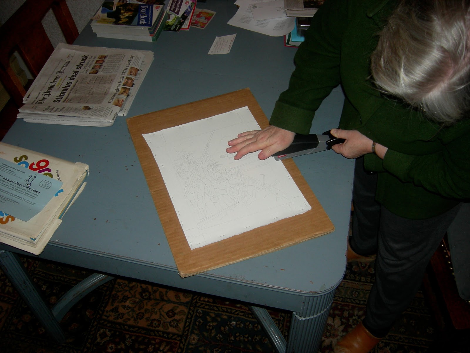
3. Staple the paper to the cardboard.
I use a regular office stapler that opens flat. Begin with one staple at the center of each side, to make sure you have your paper flat. Then staple about every 2 inches.


4. Leave the board flat until the paper is dry (unless you plan to work wet.) This takes several hours. I usually try to plan ahead so I can leave it overnight. If the paper feels cold to the touch, it's probably still wet, but you can check a corner to see if it's dry enough not to bleed.

Alternatives to stretching.

I find that soaking the paper makes it nicely receptive to washes. However, if you are not using wet washes over broad areas, you may not need to stretch good quality 140 lb. paper at all.
You can also just staple or tape the paper to a board without soaking it, and that will keep the paper relatively flat.
You can use 300 lb paper. No stretching required.
Some illustrators "paint" the back side of you paper with water, then staple it down to a board. That way they can start working right away.